Formatting for print · self-publishing

Checklist for redesigning your book cover – and maximising the marketing opportunities

3nyns
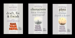
I recently changed the covers of my Nail Your Novels … and got myself a nice long to-do list as a result. But as well as refreshing the look of the books, a redesign is also a chance to smarten up the covers’ marketing potential. Here’s how.

Don’t miss the opportunity to tweak your sales wording

I’ve already blogged about changing the cover design to target readers effectively (the last time I changed the cover of book 1, as it happens). But revising the book doesn’t have to stop at the visuals. Since you published the title, have you had any standout reviews? Work them into the redesign – on the front as a teaser or the back as part of the sales blurb.

Indeed, could you add punch to the back cover copy?  Sometimes reviewers sum up our books much better than we can ourselves. A reader who really got the book might have written you a brilliant logline. Search your reviews in case.

2015-06-27 01.03.42If you have an ‘about the author’ paragraph on the back, should you update it? Perhaps you’ve published more books, or won a prestigious award.

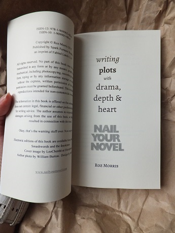
What about your author photo? My Nail Your Novels had three different author photos according to the years they were published (and the hue of my hair), but with this reboot I decided to use a new image to make them look more current and uniform. 2015-06-27 01.03.18

I also found I had room on the back for miniatures of the other books in the series – a good visual way to let readers know they’re part of a set.

Read all the copy!

Even if you change only the fonts, you should proof-read all the cover material anew. Any time a change has been made, even if it’s just cosmetic (fonts etc) there’s a possibility for a letter to be deleted or a copy-and-paste to go wrong. If the new font doesn’t behave like the old one, you might find the copy doesn’t fit – check that the final sentence of your blurb or author description hasn’t disappeared into a mysterious limbo.

Read the spine too. Mistakes can happen anywhere. Especially there.

If you’re upgrading an entire series, be alert for copy-and-paste mistakes between the books! A designer who is working on several covers at once might paste an element in from another cover as a placeholder or to copy the style, and forget to type the correct wording. Check each book has its correct title and description, and not a pasted bit from another book in the series.

Picture and artwork credits

If you’ve credited the designer on the cover, you might need to update this. And if you’ve used photo library artwork, the T&Cs might require you to credit the originator – either inside the book or in a convenient place on the artwork. Sometimes, font originators need a credit (if they do, it’ll be in the T&Cs when you acquire the font). Don’t forget to credit your author image photographer as well. So: remove outdated credits and add new ones as necessary.

2015-06-27 01.04.52Inside the print book

I’ve already mentioned updating credits for the cover images and design. What about the design of the title page? My title pages continue the design from the cover font, so I updated those too.

If you have images of your books in the back matter, they’ll need updating.

In the ebooks

If you have image and design credits in the ebooks, don’t forget to update these. Or images of your other covers.

Other admin

My books’ facelift also generated a number of other itty bits of admin

  • Website headers
  • Blog badges
  • The books’ pages on my website(s) (why did I have so many sites?!)
  • Excerpts on preview services (I use Bookbuzzr)
  • Headers on Facebook, Twitter, my newsletter sign-up, G+ …. Everywhere, really. I don’t think I’ve found all mine yet. (If you spot one, let me know!)
  • Business cards, bookmarks, postcards, posters for events

And if you smartened up the back cover copy or logline, don’t forget to update your sales descriptions on Amazon, Smashwords, Kobo, Ingram … everywhere. But you don’t have to worry about your Amazon author page or the Look Inside feature – those update automatically but you have to allow a week or so for the changes to filter through.

Is there anything I’ve missed? I’m sure there is. Tell me here!

How to write a book · self-publishing

A wrong cover and a revamp – case study of rebranding an indie novel

bookshop 12 april 023 smlYou know my bookseller friend Peter Snell, of Barton’s in Leatherhead? (He’s the co-host of our Surrey Hills Radio show So You Want To be A Writer.) Peter is a staunch supporter of indie authors, and he mentioned to me that he’d been talking to an indie writer I know who wanted advice on revamping her novel cover.

Oh you mean Alison Ripley Cubitt, I said. Her science fiction novel?

It’s not science fiction, said Peter. It’s a contemporary eco-thriller.

And therein lay Alison’s biggest problem.

So how did she end up with a cover that sent the wrong message? How was she persuaded to change it – because she’d made that choice for a good reason. And what did she change it to?

I thought this would make a useful case study. Publishers often rebrand covers if they keep a title in print a long time, and I’ve known other indie authors who’ve rejuvenated their books with new covers, aiming to catch the eye of different readers (here’s the post). And as we’re making our own decisions about everything, it’s inevitable that we’ll take some wrong turns – I’ve nearly chosen a disastrously misleading cover myself when I was releasing Lifeform Three. (Here’s the confession. You will howl.)

So thank you, Alison, for agreeing to share your process. (Alison writes with her husband under the name Lambert Nagle @LambertNagle.)

CoverRevolutionEarth2015dfw-ln-re-cover-3d

RM: How did the original cover design come about, and why did it seem like the right choice?

ARC: The photograph we used showed the terrible drought in the Australian outback and came from our extensive research. Although I knew it hadn’t been digitally manipulated, to potential customers it looked like the opening shot in a Mad Max film. We were naïve enough to think we could do the design job ourselves.

RM: I’ve found this is a classic indie mistake – to use a picture because it’s significant to the author. The reader doesn’t know your reasons and may get the wrong message.

Also, note the difference in typography between Alison’s covers. Her designer has used colours, contrasting fonts, different sizes, which all add up to a polished result.

alison
Alison Ripley Cubitt

RM: What made you decide to change your cover? Was there any feedback that made you consider it?

ARC: As I stood in a room with indie authors in Foyle’s bookshop at an author event earlier this year, I looked at their covers and realised that I’d been far too complacent. Luckily our stand was next to that of the delightful CJ Lyons (@CJLyonswriter). I asked CJ what she thought of the book and her response was, ‘it looks like sci-fi!’ I loved her honesty. With another book on the way, we decided it was time to look at the design.

RM: Peter Snell mentioned he’d given you advice. Tell me more.

Peter Snell is a real champion of indie authors. On my visit to Barton’s bookshop, I was able to compare our current cover with the thrillers on Peter’s shelves. This underscored that our cover wasn’t working.

RM: I’ve had the incredibly useful Peter cover-brainstorming tour. When I was figuring out what to do about Lifeform Three, he took me round the shelves and pulled out titles with similar themes and atmosphere to show me how this could be communicated by the cover. If you don’t have a friendly bookseller to hand, you could research the comparison titles online.

january bookshop 040sml
Peter Snell of Barton’s Bookshop

Peter had a further point about the trim size of Alison’s book. She told me she’d chosen 6 x 9 because it was the most economical in price, but …. (here’s Peter):

PS: The trim size was too big for the pagecount so the book looked too thin, which made it look self-published. In a smaller format the spine would be thicker, making it better balanced in terms of look, weight and feel. It would also fit better on bookshop shelves. Also, the design needed to be repeated on the spine so that customers could find it if the spine was the only thing visible.

RM again: Alison, how did you find the new cover designer? How many ideas did you try?

ARC: I liked Eliza Green’s cover for Becoming Human, by Design for Writers. I filled in a detailed design brief, with information about the genre, target market and tone. I told them which book covers from competitors I liked and those that I thought were clichéd. They sent me a design that I loved. They got it right first time.

RM: How much did the new cover cost? And the interior redesign (for the new smaller size)?

ARC: We were given a 10% Alliance of Independent Authors member discount which brought the cost of the cover redesign to under £200. I have allowed a budget of £100 for the reformatting of the interior, So far, we haven’t had to spend that money, as we’ve done much of the work ourselves.

RM: How are you publicising the change to ensure your fans don’t get confused?

ARC: I am stressing to readers that the print version is a relaunch and not a new book so that they don’t inadvertently buy the same book twice. It’s easier with an ebook as a potential purchaser gets a message stating that they have already purchased it. We are kicking off the publicity campaign at a book signing at Barton’s in Leatherhead on July 11th.

RM: On the new cover you have a lot more supporting text – the series tagline, the review stars. This makes it look more ‘dressed’.

ARC: In the original cover, there was no supporting text. That’s because we did it ourselves! I was pleased that we were able to fit both the pull quote and the stars from one of our reviews on the cover. The series tagline was important as it tells readers that Stephen Connor is a character they’re going to see again in the next book.

RM: It’s a challenge to get a lot of elements onto a cover and make them look good. If you don’t know about typography, you can end up with an unholy mess. But notice how Design For Writers makes it all work.

ARC: We lengthened the synopsis on the back cover too.

RM: Many indie authors don’t pay enough attention to the look of the back cover. But it’s a chance to hook readers with an intriguing teaser, and quotes from reviews. Don’t waste this space.

RM: What about badges? The indie world is bristling with awards and rosettes. Alison mentioned to me that she had a Brag medallion and an Awesome Indies seal, but they’re not on the front cover. Alison?

ARC: We’re thrilled to have the badges but we didn’t include them on the cover as readers might miss some of the lovely design details.

RM: I’m in agreement here. I’m very grateful for my various awards, but they clash with my cover designs. But if you’d like to inc lude an endorsement, a good solution is to write it as a line of text.

To return to the start, Peter and I recorded an episode where we toured the bookshop, discussing covers and why they worked. Cover art on the radio? We are fearless. Listen to it here (slide the cursor onwards a little – the file includes the songs that were playing before our slot).

RM: I’ll leave the last word to Alison:

ARC: I would love to get feedback from writers who have had new covers made and to find out how it worked for them.

RM: The floor is yours – discuss!

How to write a book · self-publishing · Writer basics 101

‘I feared I’d never get the blurb finished in time for the launch’ – guest post at Jami Gold’s

1. Take 100,000 words.

2. Stuff that into three paragraphs or so.

3. Don’t leave out anything important.

Welcome to summarising your book for the back cover or for pitching to an agent.

A few of you may well remember the frantic email sessions last summer as we batted ideas back and forth for my novel’s flap copy. I proved that despite having written a reasonably lucid novel, I was entirely incapable of distilling it into a suitable blurb. I think it took six weeks, several false starts and wrong turnings – many of which I didn’t want to abandon because they’d been hard enough. Did three paragraphs ever cause such anguish?

Anyway, I learned a lot in the process, and today I’m at the blog of paranormal author Jami Gold, sharing all my tips.

One of those tips is to not become too attached to the wrong soundbite. Boy, I nearly hobbled myself there. You can see my blurb outtakes at Jami’s lovely blog, but in the meantime I thought it would be fun to share here some wrong blurbing that we’ve done.

Tell me, in the comments, the blurb or pitch you had to junk – and why it was soooooo wrong. I look forward to sharing your pain…