

This Friday, around 50 indie authors (including yours truly) will gather in Foyles bookshop in London’s Charing Cross Road to showcase their books as part of the Indie Author Fringe Festival. We’ll see some swish productions from experienced selfpublishers – but not all indie paperbacks look quite so slick.
Peter Snell, my bookseller friend and co-host of So You Want To Be A Writer at Surrey Hills Radio, is a staunch supporter of indie authors – but he often shows me paperbacks with rookie mistakes that scream ‘amateur’. So here’s our checklist of goofs and gaffes – and how to make sure your book passes muster.
Front matter
Some indie books launch straight into the text, which looks rather underdressed. Why?
Look at the opening pages of any print book and you’ll see the following:
- a half-title page – this shows the title on its own, or the title and author name in the text font, or a brief (one-paragraph) introduction to the author and the book
- a copyright page
- a full title, maybe echoing the cover typography, with author name and the publisher imprint
a page that lists other works by the author - contents page
- start of text
You might also have a dedication page before the text starts or a foreword (which is an introduction not written by the author).
On the other hand, some indie books dither around too much before the text, with pages of acknowledgements and biographical material.
The reader wants to get on with the book. So front matter should be concise and useful – eg contents pages, of which more in a minute. Contents pages go very wrong.
Right or left?
Certain pages have to be on the right, others on the left. Here’s that order again:
- half-title – right
- copyright page – left
- full title – right
- other works, dedication etc – left
- contents – right
- start of text – right
Yes, that’s two rights. If necessary, insert a blank page so that the text starts on the right. After chapter 1, though, you can start new chapters on a left. You’d have to go through mad contortions otherwise. But if your book is divided into sections (like My Memories of a Future Life) you want those to start on a right.

Contents pages
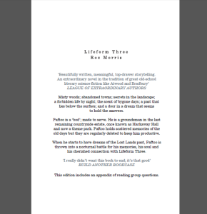
You don’t usually need a contents page in a novel. Does the reader need to know that chapter 11 starts on page 49? I draw your attention to Exhibit A at the start of this post.
If your chapters have titles of their own, you might list them to whet the reader’s appetite. But it’s not compulsory, and novels, memoir and narrative non-fiction don’t usually need contents pages.
Instructional and reference non-fiction, on the other hand, definitely needs a list of contents. Here’s an example of one that is helpful to the reader and also a good appetiser for the book. (It’s Reports from Coastal Stations by Geoff Saunders.)
Who’s the author?
Some indie books fail to give any information about the author. Readers like this context – who the author is, where they live, how many books they’ve written. If the book is set in a special world (eg the circus), this is where you reveal you were the offspring of trapeze artists before you ran away to study accountancy. If you’re writing non-fiction, readers need to know why you have the temerity to bother them with your opinions.

You might put this in the front matter, if you can keep it brief. Or it might be on the back cover. But don’t miss it out.
Speaking of back covers…
Back covers need to look properly furnished. Make sure you have
- a punchy summary
- an enticing quote, if possible
- author details, and preferably a picture
Other sundry howlers that stop your book being taken seriously:
- white paper stock for fiction, memoir or narrative non-fiction (better to choose the cream-coloured paper)
- squashed typesetting and tiny print – authors do this to reduce the pagecount and save costs, but it makes the book a chore to read (there’s more here on formatting your book for print)
- narrow margins, either around the edges or in the gutters (the central margin). Again these decrease readability, and if the gutter is too narrow, you have to break the spine to read the book.
- amateurish or unnecessary artwork. Tables and charts might be necessary in non-fiction, but probably aren’t in adult fiction. Maps and family trees might be helpful for certain genres of fiction, and facsimiles of handwritten notes or other ephemera might funk up a YA novel. But you might not need your aunt’s watercolours, unless a lot of your straight-talking friends agree they add to the book’s charm. (They usually don’t.) And covers are a whole subject by themselves. (More about covers here.)
- lack of an ISBN – CreateSpace and Lightning Source require an ISBN, and CS will issue you with one if necessary. But Lulu or local printers will let you print without them. Most readers probably wouldn’t notice if your book lacks an ISBN, but it really, really annoys Peter, who is still reeling at the author who had regained the rights to her work and printed 1000 copies without obtaining an ISBN. (There’s more here about ISBNs.)
- Peter also grumbles about books that are in a big or unusual format that won’t fit on his shelves. And cut-outs or holes in the jackets, because they catch on other books and get torn. (They probably also cost you more.) He does, however, approve of French flaps, which make a book more solid, though they’re not standard issue and most people won’t mind if you don’t have them.
So, to sum up. The well-dressed print book:
- has a complete set of front matter that is concise and helpful
- follows the conventions of right and left
- has a contents page only if necessary
- gives information about the author
- has an informative (and enticing) back cover
- doesn’t cram the page with type
Have I missed anything out? Or do you have any questions? Head for the comments!
If you’re in or around London next Friday, come and say hello at the Indie Author Fair, which is part of the Indie Author Fringe Festival in association with the London Book Fair. Entry is free, though you need to register and print out a ticket. More here. If you’re further flung (and even if you’re not) you can take part in Indie ReCon, from April 15 to April 17 – an online festival of indie movers, shakers, experts, veterans, trailblazers, and the odd person who was surprised to find themselves volunteered. You’ll find seminars, live chats and roundtables and …. oh just click this link. http://indierecon.org/indierecon-events/ To wet your appetite, here’s a video discussion from last year in which a few authorly types talk about how we tame our creative muse.

interesting about holes in covers – well above and beyond most of our price range but two of my favourite books in the world – Savage Detectives and 2666 have them and they are, indeed, one of the instantly recognisable features of all Bolano novels. Absolutely agree about the flaps though – a lot of the really classy indie imprints – Peirene and Pushkin spring straight to mind – have them and they add a really classy feel
Hi Dan! Good to see you here as you’ve been more adventurous than most with print publishing.
I agree that the holes look intriguing. But I had little appreciation of how fragile books can be until Peter pointed it out. They get scuffed, fingermarked creased, torn – all of which means the book no longer looks pristine for the customer.
Something I’d really like to be able to do is print on the inside of the cover. It creates a luxurious feel.
Interesting.
Thanks, Raul!
This may be a small detail, but I’ve often seen dedications on the right, not the left. Is this acceptable, too?
Hi Natalie! It doesn’t matter too much if the dedication is on the right. However, as there are more pages that must go on the right than page that are fine each way round, it makes sense to put the dedication on the left because you can avoid having another blank.
This is a nice summary of typographic standards for print books, Roz. If authors at least did as much as you suggested, their works would look a lot more pro. I’d add the following minor details to the list for extra credit:
Chapters and scenes:
* Start every new chapter on the right, inserting a blank page if necessary.
* The blank page has neither a heading nor a page number, although it does “count” as an even-numbered page in the sequence. (Page numbering starts with the first right-hand page of content.)
* Chapter pages usually have no heading, and they may or may not have the page number at the bottom.
* The first paragraph of a chapter (and after a scene break) should not be indented.
Content pages:
* Page numbers typically go in the upper left on a left (aka verso) page and in the upper right of a right (aka recto) page. Putting page numbers centered at the bottom is common, too.
* The author name is often centered at the top of left-hand pages and the book title is centered at the top of right-hand pages.
Anyone who has an interest in putting out a pro-looking print book should check out Joel Friedlander’s site, TheBookDesigner.com.
Hi Daniel! I thought you’d have a few things to say here.
Good points about the page numbers (known as folios if we’re being really technical) on blank pages, and the running heads on chapter titles. And the indents after a chapter title or scene break. (Though in my experience, the folios on a chapter title page are not an absolute sin.)
I agree about the folios on chapter title pages. I’ve seen it multiple ways, and I prefer to have the page number centered at the bottom. Having the top of the page clear of any page headings/numbers makes the chapter glyph, chapter number, and chapter title stand out better, IMO. I’m sure it’s a matter of personal taste.
As for chapter titles, I didn’t put them on my first book, but regretted it when I released the ebook edition. The EPUB standard requires a TOC, and it seemed pointless to have one that read Chapter 1, Chapter 2, and so on. From then on, I named my chapters, and now I think it’s fun to do so. I name all of my scenes for my own reference anyway. When I assemble the book into chapters, I usually just choose one of the scene titles.
To avoid spoilers, I usually keep chapter titles short and avoid using character names (unless the character name *is* the title because it’s where I introduce the character). I usually name them after a significant location or event (in vague terms) that gives the title mnemonic value *after* the reader has read the chapter.
I personally don’t see much point in chapter titles for fiction because I don’t use them myself. However, I know readers who do like and use them, so I figure I might as well give them something functional.
I’ve always avoided listing chapters because in my early reading days, I’d see things like ‘Peter returns from the dead…p48.’
Spoiiiiiler!
When Peter goes missing on page 36 and eveyone fears the worst, my mind would throw up ‘don’t worry, he’ll be back in 12 pages.’
I don’t want any pointers or spoilers in a fiction book. Leave chapter lists for non-fiction!
Hi Andrew – ho ho, yes that’s a good reason to consider not using a contents page for fiction! Unless you can make your chapter titles suitably obscure.
Reblogged this on JCU // Creative Writing Workshop.
Agree with all of these, but am I the only one who doesn’t notice, or doesn’t pay attention to the color of the paper? Of all the things listed here, that one seems to be the least significant. Just my opinion.
One suggested change. The definitive (for many) Chicago Manual of Style places the copyright page AFTER the title page, as does every book I can recall reading.
You might consider the copyright page as the librarians page. I put almost everything that a librarian would want to know about the book there, including a short description of the book suitable for their online database. Chicago suggests putting a brief biography of the author there too. That might also find its way into library databases.
If you don’t want to waste that left-hand page between the half-title and title page, it’s a great place to put promotional blurbs about the book. It’s more likely to be seen there than anywhere else.
Bookstores like to shelve books by BISG subject headings and libraries often use them for subject classifications. I usually include three of them on the copyright page. You can find them here:
https://www.bisg.org/complete-bisac-subject-headings-2014-edition
When chapters are short, starting each on a right-hand page can force you to raise the price to cover the added printing costs. For several of my recent books, where I tried to keep each chapter less than 2,000 words, I didn’t worry about that right-hand rule.
If you’re thinking of including pictures, and you certain should for audiences now used to picture-rich web pages, give serious consideration to placing them at the start of each chapter. That not only livens up the beginning of each chapter, with digital books where you’re breaking the page for each new chapter, that ensures the picture fits well on its page and doesn’t trigger any awkward page breaks on tablets and smartphones.
Stock photo services that cater to businesses, such as Big Stock and Deposit photos, have literally millions of professionally done photos and often sell them for under $10 each. They may not work with every book, but they’ve been marvelous for the books I’m writing about when I worked in a children’s hospital.
Reblogged this on break the system.